Scarlett's Rebrand
Scarlett's Rebrand
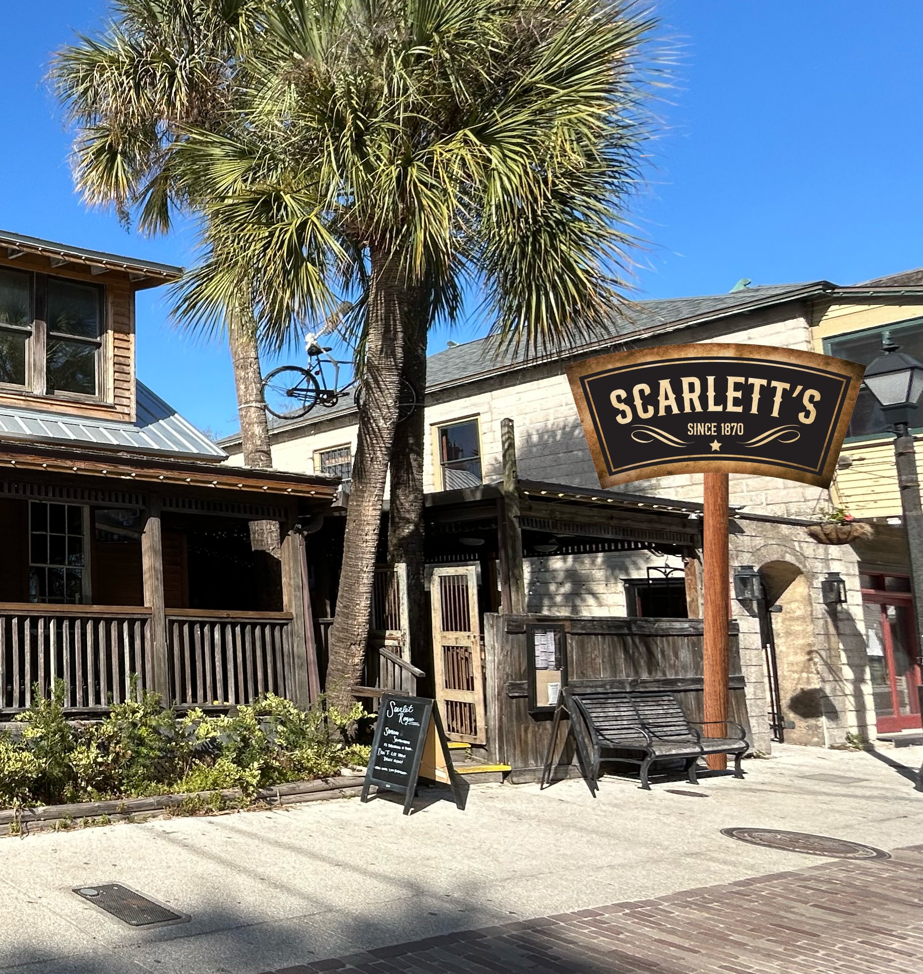
Scarlett’s has been a cornerstone of Saint Augustine since 1870, known for its rich, haunting history and community presence. After closing due to bankruptcy, Scarlett’s found a new owner and reopened as Scarlett Rogue. However, the new branding failed to connect with its audience, making a rebrand necessary to restore its identity and embrace its storied past. Scarlett’s is more than a pub—it’s an experience filled with stories and legends. The rebrand focuses on its haunted reputation and deep historical roots, making it a compelling destination for both locals and tourists. The community has always naturally referred to the pub as “Scarlett’s,” so retaining this name ensures continuity and simplifies brand recognition. Additionally, Scarlett’s needed a clear tagline and core purpose. The upstairs bar, famously known as “the ghost bar,” gained its name after the original owner was found dead under suspicious circumstances. Many guests have reported feeling an unusual presence, as if they have an uninvited guest dining and drinking with them; which is the inspiration for the trueline, tagline, and core purpose.
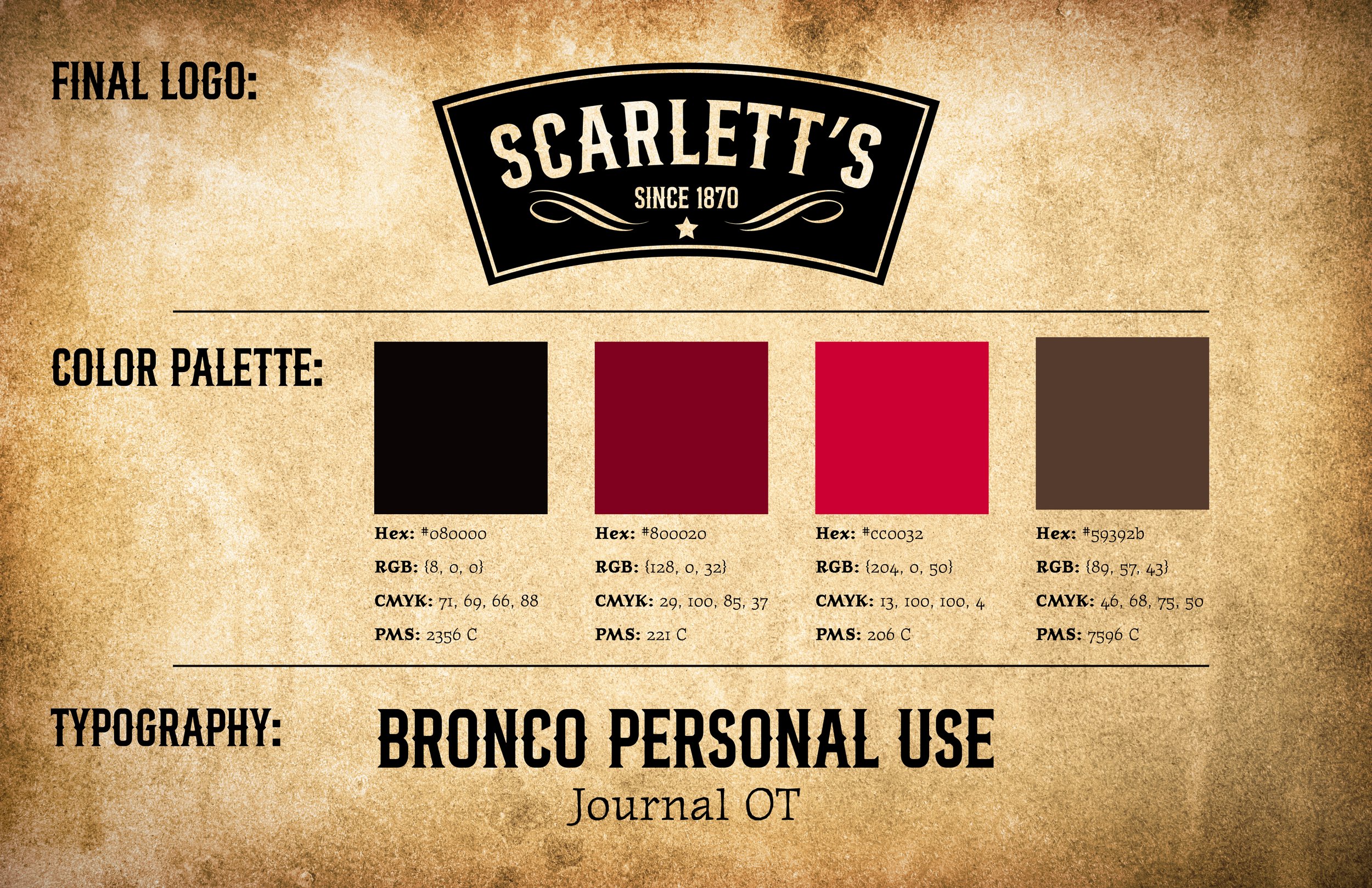
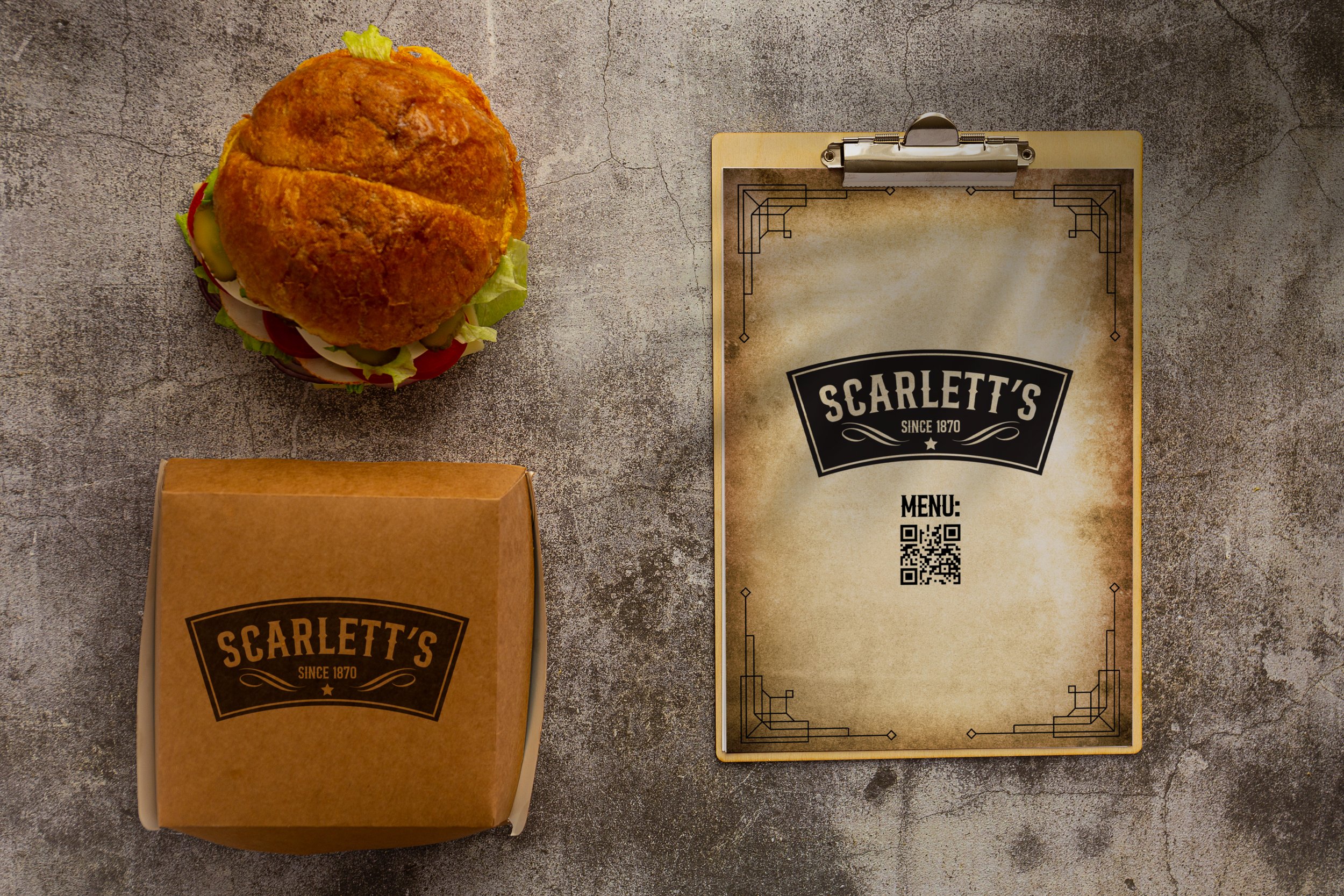
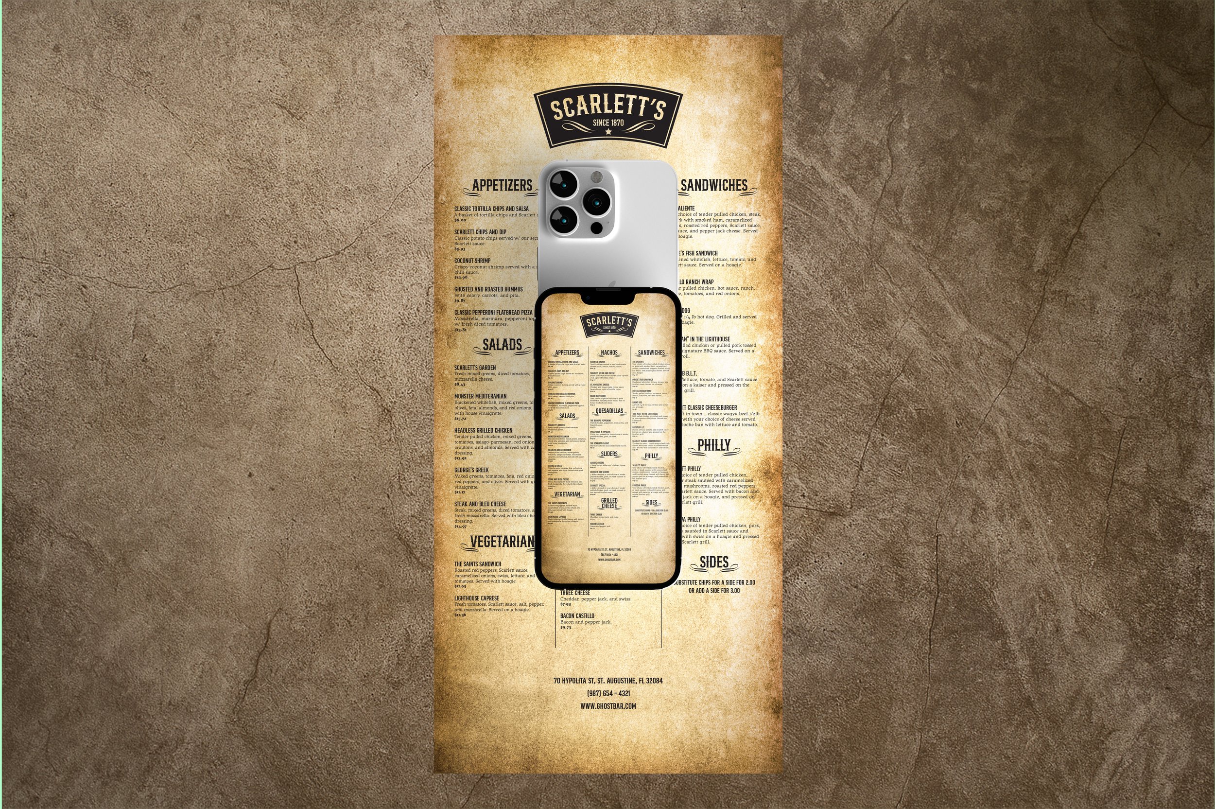
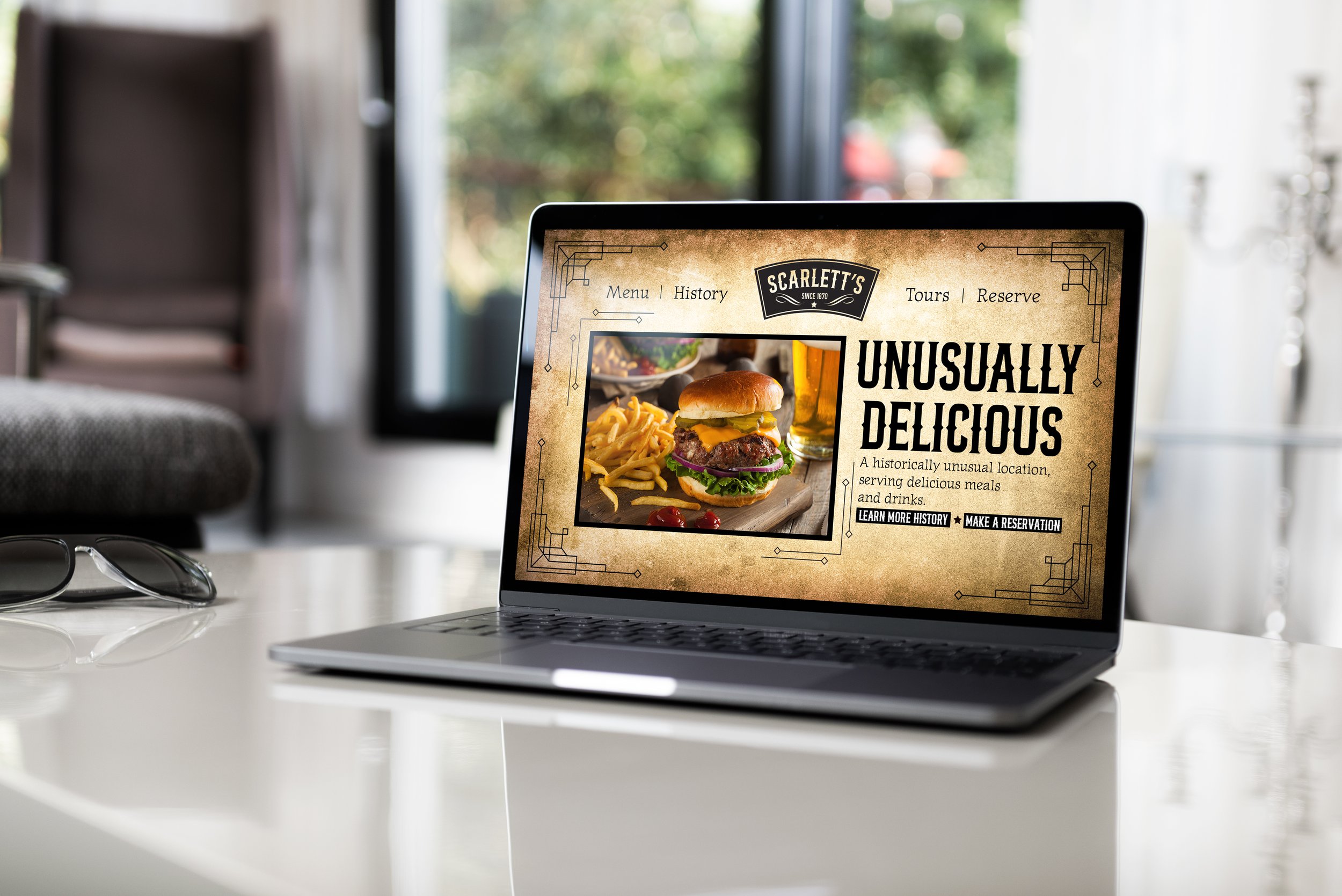
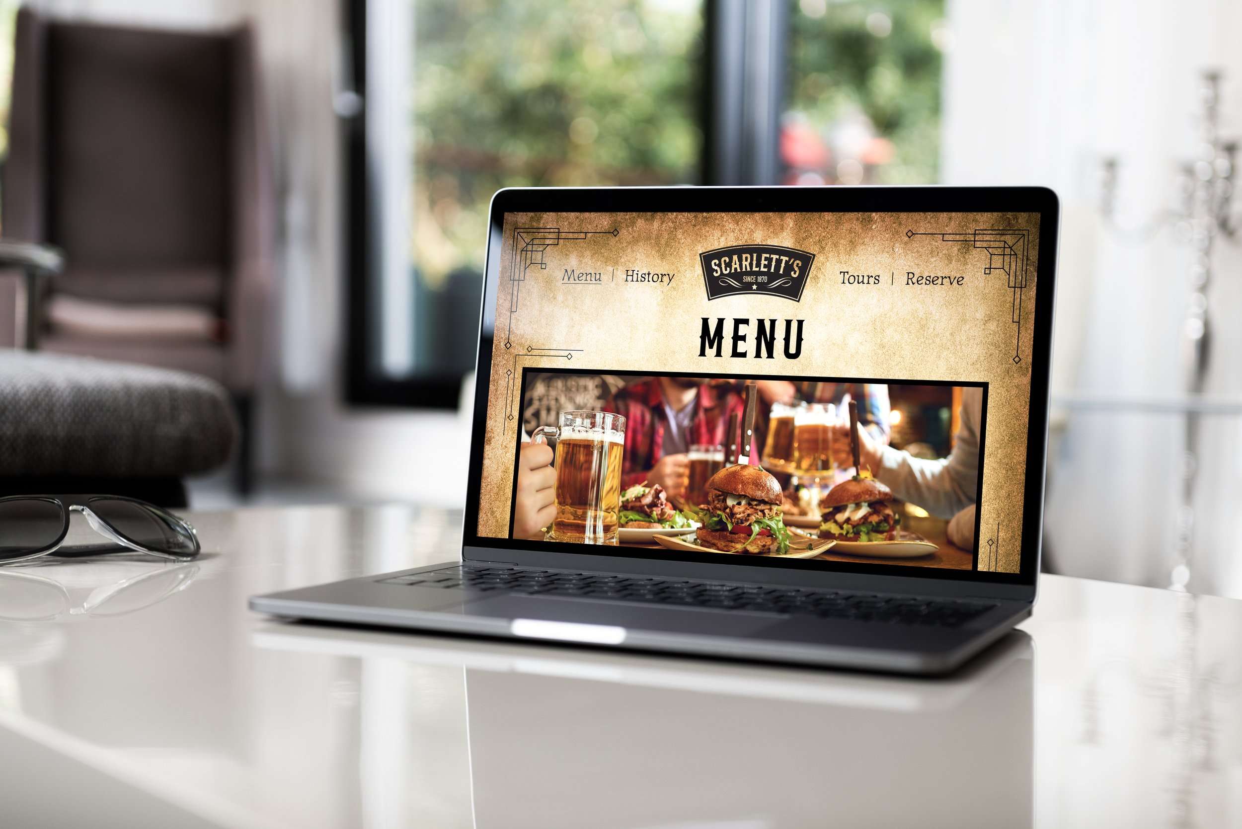
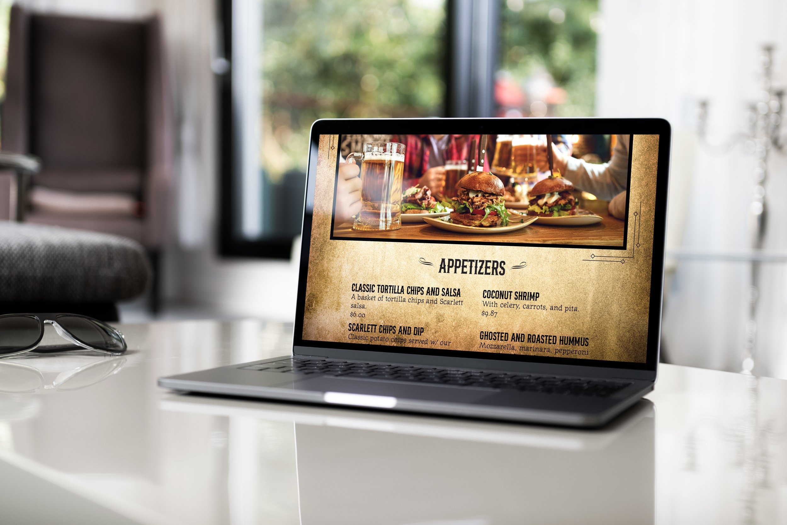
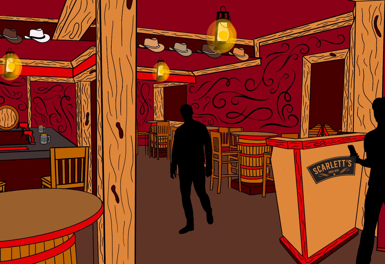
The new branding embraces a wild west revival, featuring a vintage-style black-and-white logo, a deep scarlet red color palette, and typography using Bronco Personal Use and Journal fonts to reinforce the western aesthetic. The rebrand also includes a redesigned logo, print menu, website, and interior elements. Messaging highlights Scarlett’s haunted past and long-standing presence, making history an immersive part of the dining experience. Scarlett’s attracts tourists seeking unique experiences and locals who appreciate its historical significance. Through a cohesive verbal and visual identity, Scarlett’s rebrand reestablishes it as a historic landmark—where history, mystery, and great food come together.