Futura
Futura
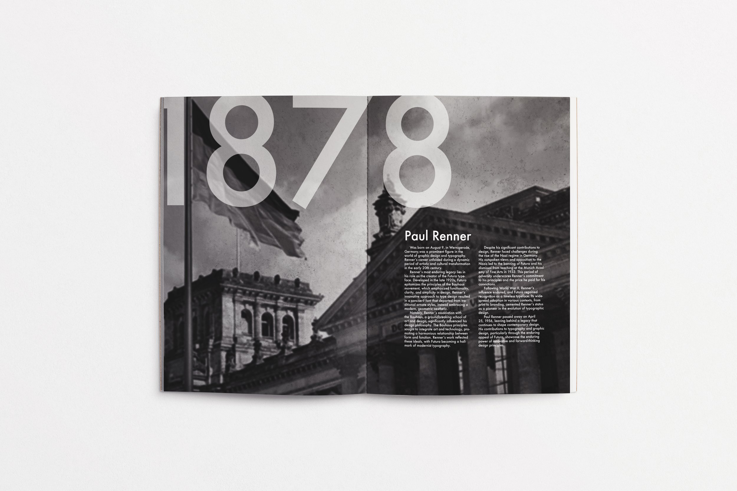
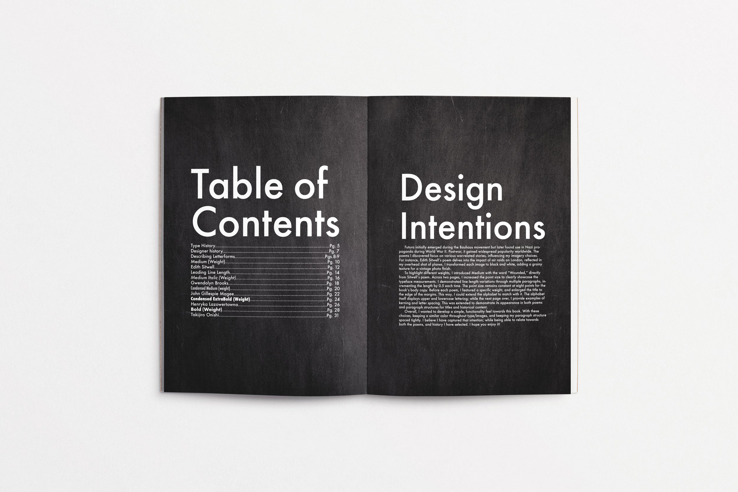
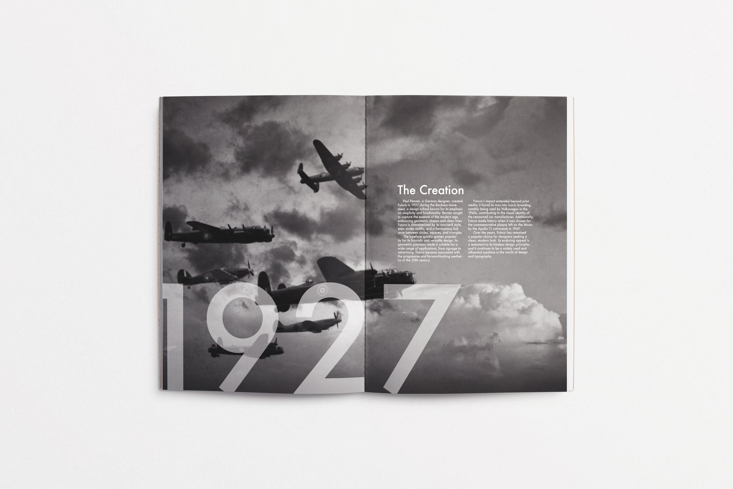
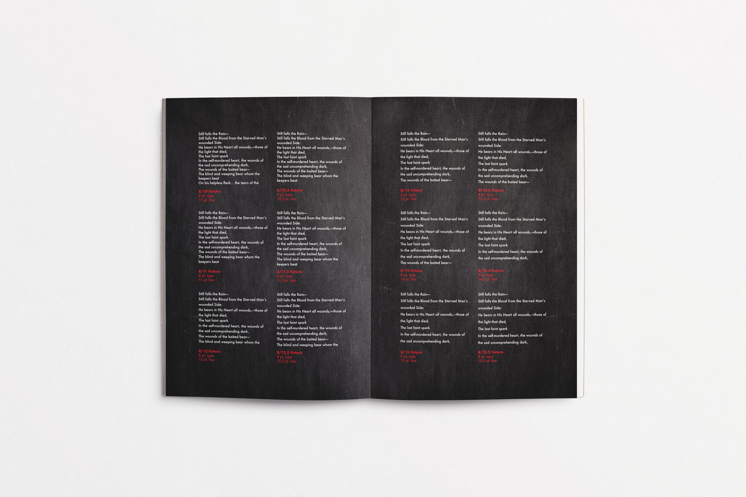
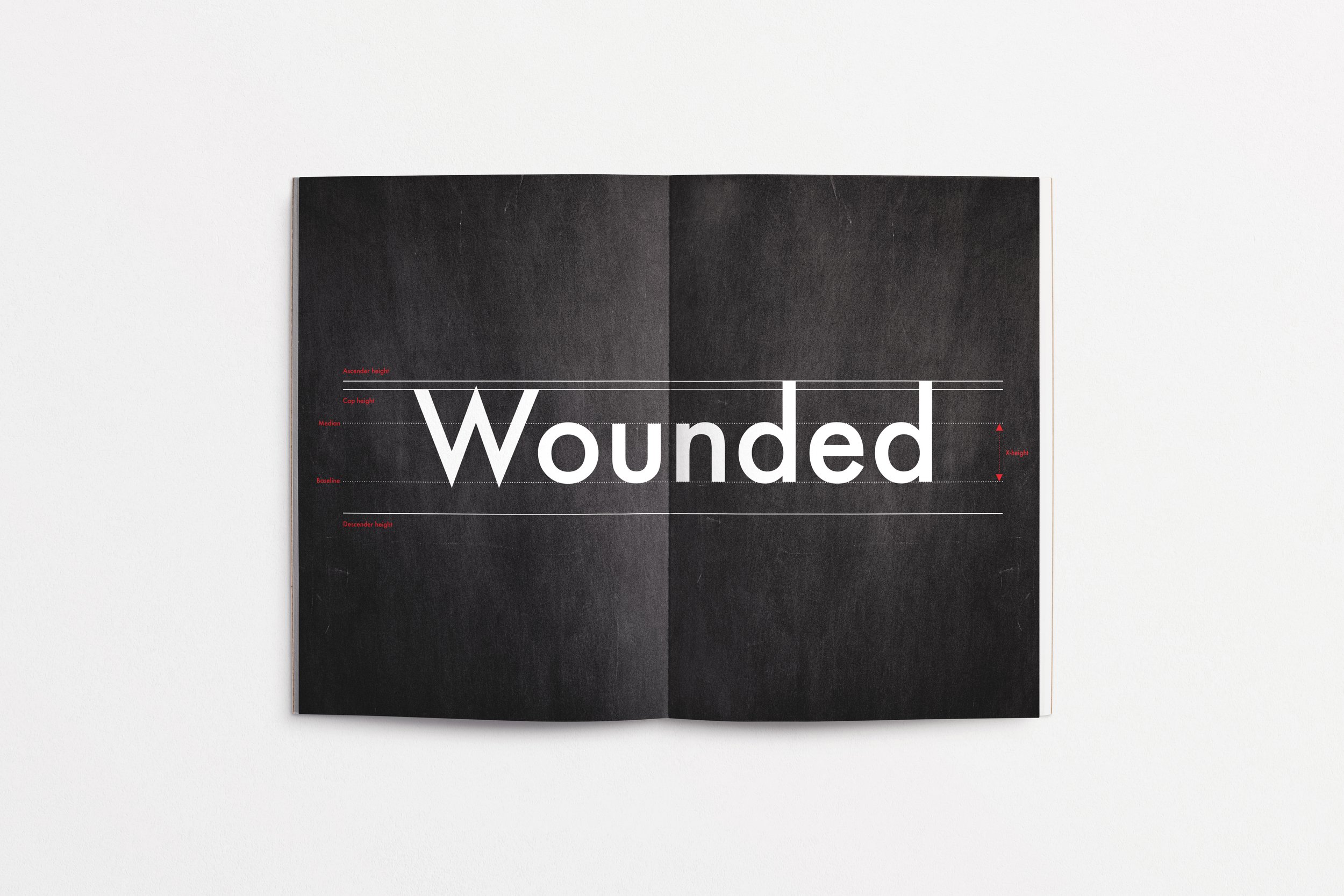
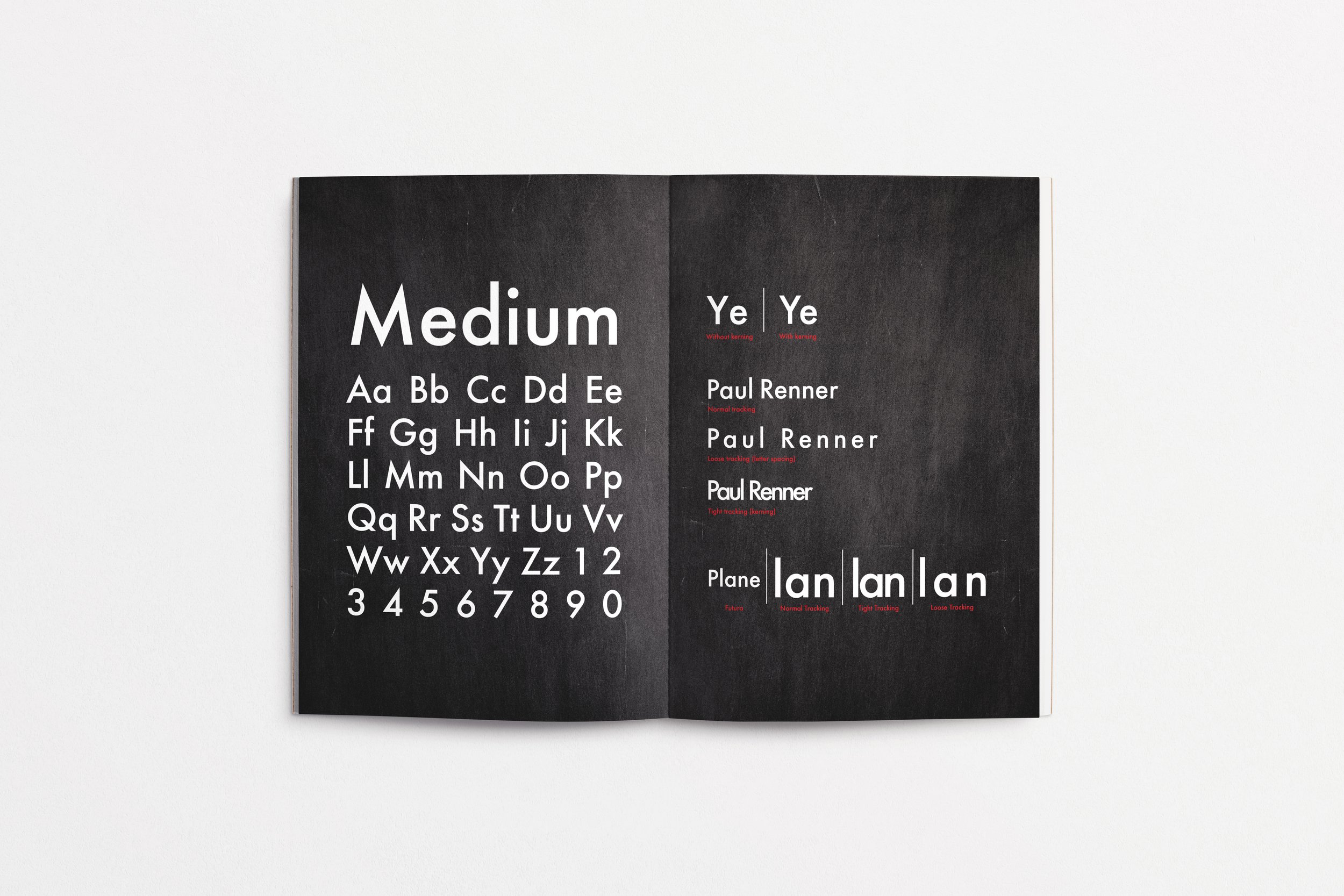
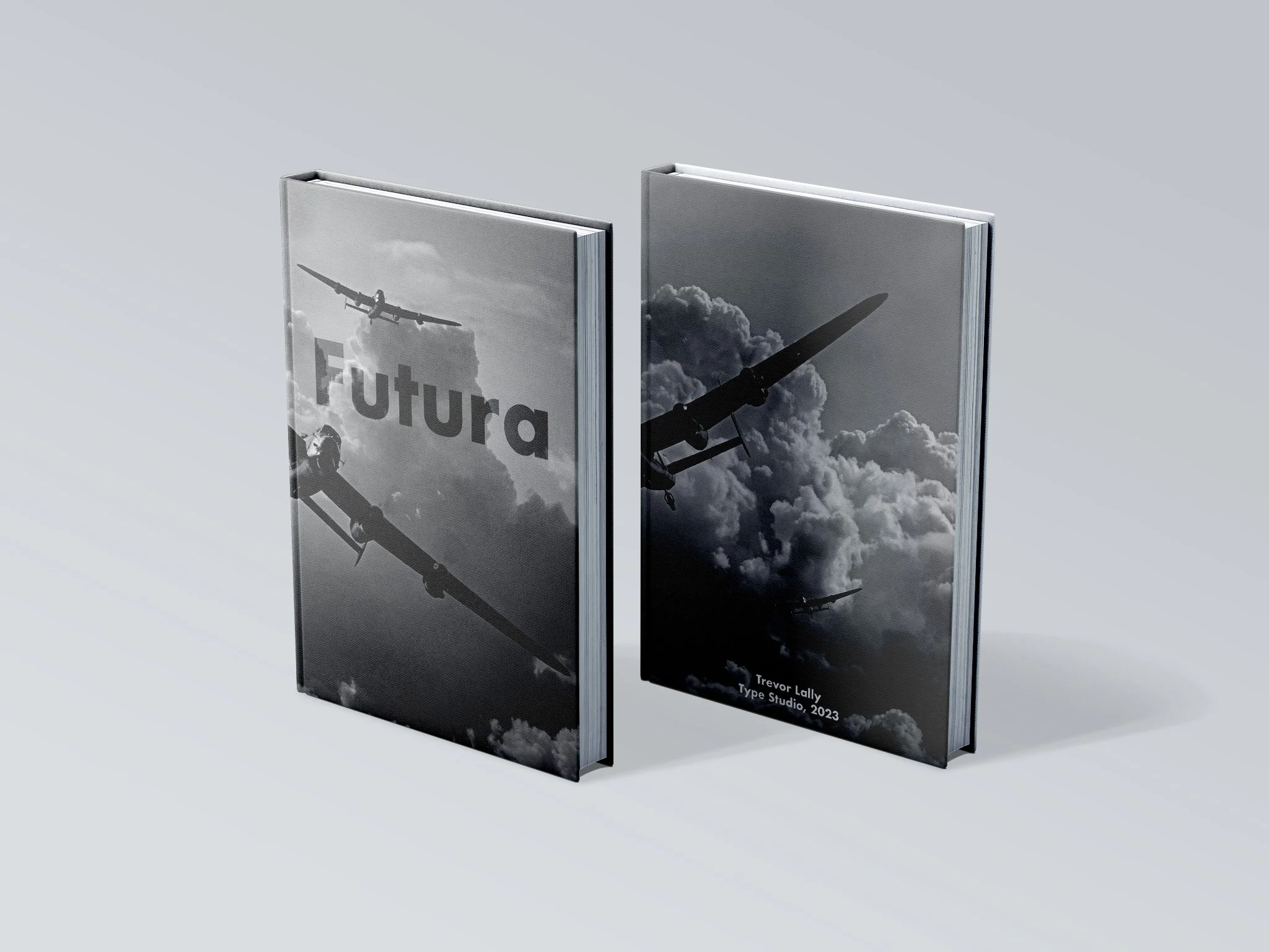
The Futura type book serves as a visual and historical exploration of one of the most influential typefaces of the 20th century. Designed by Paul Renner in 1927, Futura embodies the principles of the Bauhaus movement, emphasizing geometric precision and modern simplicity. This book not only showcases the typeface’s aesthetic versatility but also delves into its historical significance, particularly its association with World War II. The book is structured to highlight each weight of Futura, demonstrating its adaptability across various applications. Through carefully curated poems and layouts, the type book illustrates how Futura’s bold yet minimalistic design conveys both strength and elegance. Each spread is thoughtfully designed to contrast its lighter weights with the heavier ones, creating a dynamic reading experience that reinforces the typeface’s functionality and impact.
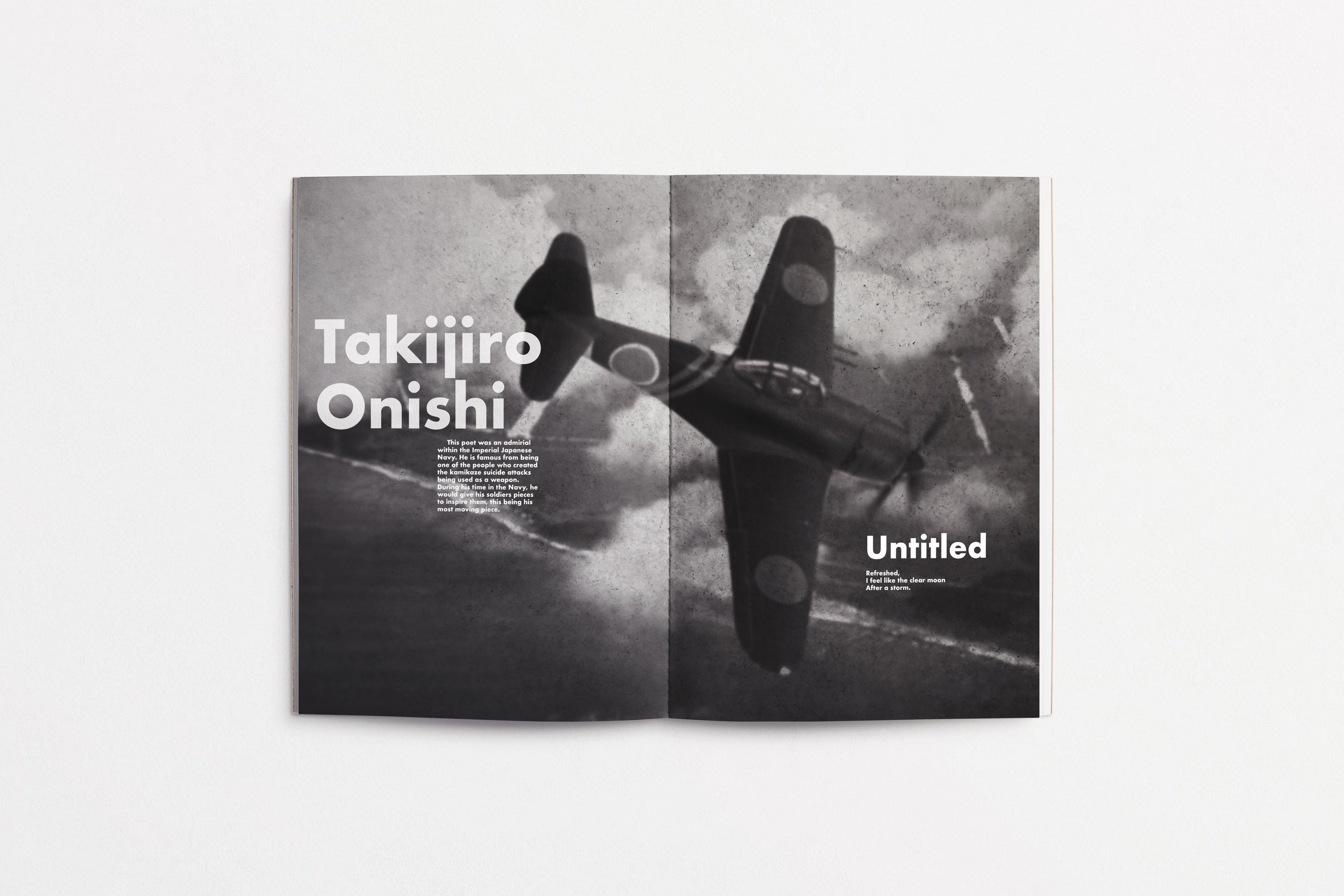
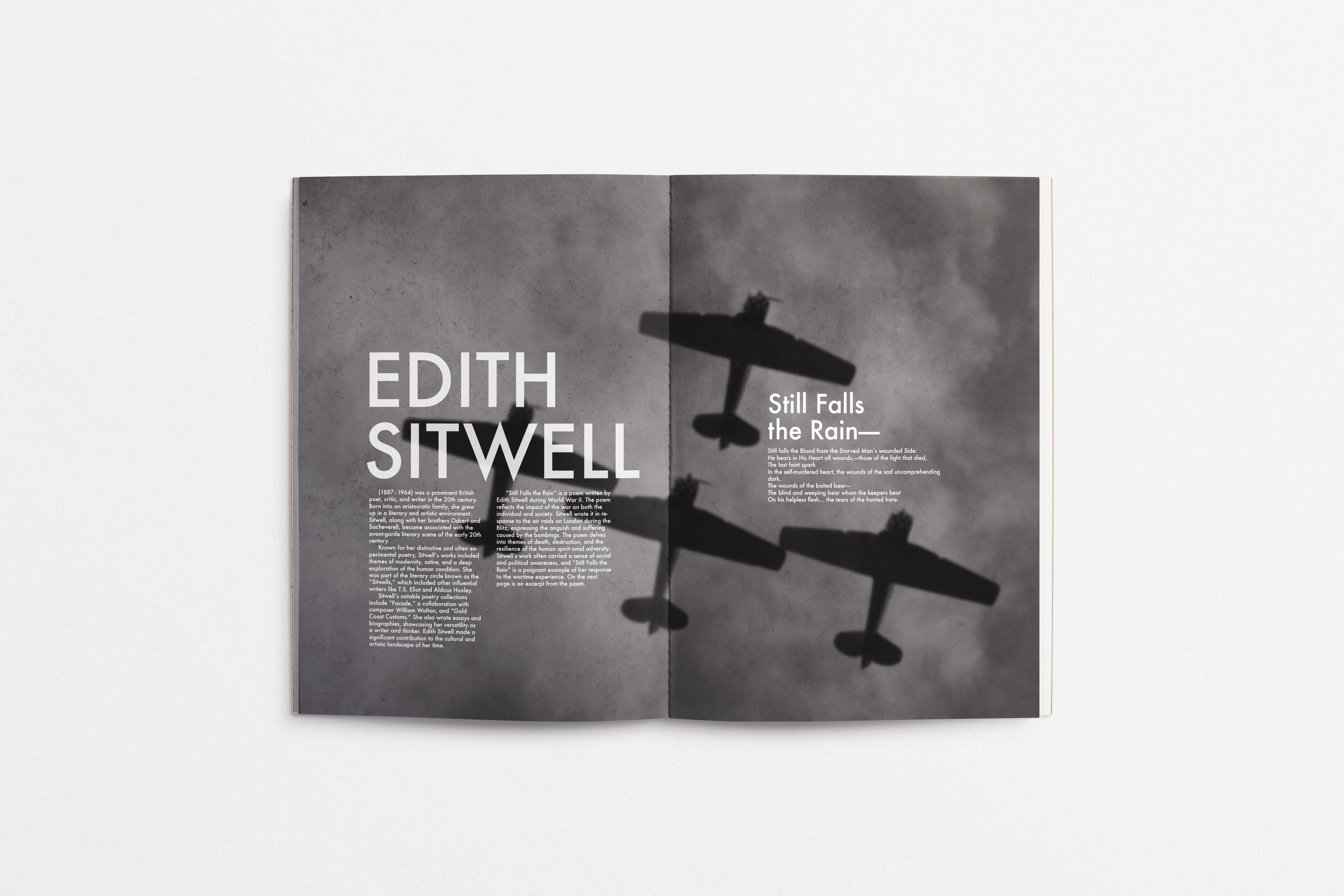
A key focus of the book is the cultural and historical backdrop against which Futura emerged. The typeface was widely used in propaganda, advertisements, and publications during the tumultuous era of World War II. This historical context is woven throughout the book, emphasizing how typography is not merely a design choice but a powerful tool that reflects societal shifts and ideologies. By integrating history, literature, and design, this type specimen book serves as both an educational resource and a visual homage to Futura. It reinforces the typeface’s enduring relevance and its ability to bridge the past and present through timeless, modernist principles.